Three quick mobile updates.

That’s what it’s all about these days. Speed. So there’s no time to lose. Let’s do this – three quick mobile updates that are changing the ways we use our smartphones.
1. Micro-moments.
Flicking through this article on your mobile? Our data suggests that at least 1 in 5 of the people who read this will do so on their phone.
We’re spending more time on our mobiles, in shorter bursts. We’re increasingly using them to take action too.
The numbers suggest that on average, we check our phones up to 150 times a day, usually in sessions that last for around 70 seconds. Overall, mobile sessions are up 20% with mobile conversion rates experiencing similar growth at 29%. The one drop? Session duration, falling 18%.
Hence the increasing relevance of the ‘micro-moment’. We’re using our mobiles more often, in more condensed bursts.
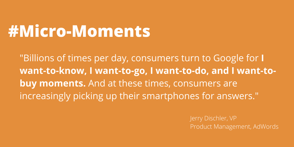
Source: http://www.add3.com/wp-content/uploads/2015/06/Micro-Moments.png
But wait, there’s more! For further evidence in support of the ongoing move towards micro/mobile, consider that:
- We increasingly consult our mobiles before making choices, both big and small, with 82% percent of smartphone users consulting their phones on a purchase they’re about to make in-store, and a whopping 91% turning to their mobile for inspiration during a difficult task.
- Availability trumps loyalty, with 65% of users agreeing that they’ll look for ‘relevant’ information rather than material from a trusted provider. 90% of shoppers are uncertain of the brand they hope to engage with when they start shopping for a product or service on mobile.
- We like consuming content, quickly. 29% of smartphone users will switch to another site or app if the one they are using doesn’t meet their needs: if it takes too long to load or there are too many steps involved. That might not sound like a huge statistic, but 40% of mobile shoppers will wait no more than 3 seconds before deciding to abandon a retail or travel site.
In spite of these trends, the same basic principles that apply for UX are relevant on mobile. The subtle differences occur because of context and expectation. We’re generally on mobile when we’re out in the world, either on our way somewhere or in the middle of something.
The challenge goes beyond just having a site that loads quickly on mobile. It’s also about anticipating how an audience’s needs can change based on context. For example, how someone might behave when it’s raining vs when the sun is shining.
Establishing that kind of insight takes a crystal clear understanding of the user journey, but it’s worth putting in the work to glean those insights. Although they seem small, a positive micro-moment can have a hugely beneficial impact on a user experience.
2. AMP Pages.
AMP stands for Accelerated Mobile Pages (our need for speed apparently even extends to shortening the names of these fast-paced mobile developments). It’s an open source initiative that improves mobile browsing by creating content that is optimised for smartphones.
AMP articles are handy for a couple of reasons. They allow companies to create versions of their material that are optimised for speed and therefore load much faster. While styling is limited to stripped back CSS and HTML, it still offers developers enough freedom to customise content to be in line with a websites overall branding.
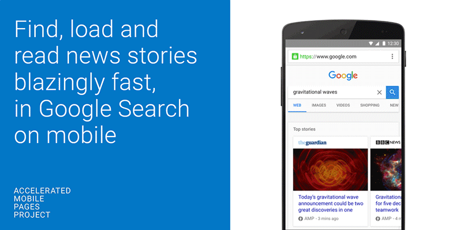
Source: http://www.e-xanthos.co.uk/blog/wp-content/uploads/2016/02/AMP-demo.gif
They’re already proving popular. Over 200 different content publishers – big and small – have started to embrace AMP already. With good reason. AMP articles have just been added to Google search results in the US, and Australia won’t be too far behind. As AMP pages become increasingly common, we’ll likely start to see this mobile-optimised content being prioritised over standard pages.
Similar initiatives include Facebook’s Instant Articles (or FBIA in acronym form, for speed’s sake) and Apple News. They’re all relatively similar, with a couple of minor exceptions.
FBIA content is only shown to people using the Facebook app while Apple News is only available to the iPhone and iPad. AMP content is currently used in Google search and across a smattering of social and blog sites.
Major platforms like Google and Facebook have a significant stake in providing audiences with the best experiences possible. So companies who embrace the most recent and relevant user-centric updates will find that their content gets more traction.
As a result, it has a greater chance of reaching more people and ultimately being more effective. So you’re AMPlifying content, in more ways than one.
3. Continuum.
The ongoing shift towards mobile means that the ‘big screen’ is now actually the small screen in your pocket. Put plainly, mobiles are overtaking desk or lap tops as the device we use the most. PC sales have been dropping year-on-year as smartphone penetration increases.
To capitalise on this trend, Windows have developed the Continuum update for Windows 10. With Continuum, your mobile can now be plugged into any screen and run Windows software like a PC. It seems Microsoft’s goal has gone from putting a PC in every home, to putting one in every pocket.
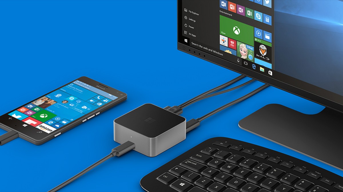
Source: http://i1-news.softpedia-static.com/images/news2/continuum-for-windows-10-is-phone-convergence-but-not-as-advanced-as-ubuntu-s-493904-2.jpg
It’s unfortunate that such a cool feature only exists on such an unpopular mobile OS platform (Windows currently only enjoy 5.8% of the Australian market share), but it’s typical of providers to try to create an insular product system.
Don’t be surprised if we see similar developments from Apple and Google for their own platforms in the near future, in a similar way that AMP-style initiatives are rolling out with FBIA and Apple News.
More Articles
Up for some more?
Get your monthly fix of August happenings and our curated Super8 delivered straight to your inbox.
Thanks for signing up.
Stay tuned, the next one isn't far away.
Return to the news.