
- |
- |

A digital donation form is a crucial fundraising tool for any charity or not-for-profit organisation. And although most people come to such forms with the very best of intentions, not everyone ends up getting to the end of the donation process and making a contribution.
In fact, an annual study that analyses hundreds of millions of visits made to almost 200 not-for-profit organisations’ websites, consistently finds that there’s an average conversion rate of just under 20%.
Why? Why would fewer than one in four people who visit a general donation page actually go through with a transaction?
There’s no single reason that explains this rate of abandonment. Perhaps the cause isn’t quite what a would-be donor thought it was. Perhaps, at the point of payment, they realise they aren’t in a position to donate after all. Perhaps there are other personal reasons that make a donation unlikely or impossible for that person at that moment. You, as a marketer, can’t control any of that.
But there’s also a good chance that generous people are coming to your page and being negatively swayed by something you do control?
It could be that your microcopy is not quite right. It could be that your website is difficult to read for people with low vision. It could be that the page is loading too slowly. It could be that the payment options you offer aren’t what supporters are looking for.
Or it could that your potential donors are getting distracted.
It may sound like a small thing, but there are so many possible diversions, interruptions, and intrusions you can remove from your donation page. And by getting rid of them, you increase the likelihood of a website visitor completing the task you want them to.
In this article, we’ll look at some examples of not-for-profit donation pages from around the world that provide visitors with only the most essential donation information and instructions.
Animals Australia
Not long ago, Animals Australia made a change to their donation form, adding the option of donating on behalf of a loved one. At the same time, they made some changes to what website visitors saw once they clicked through to that form.
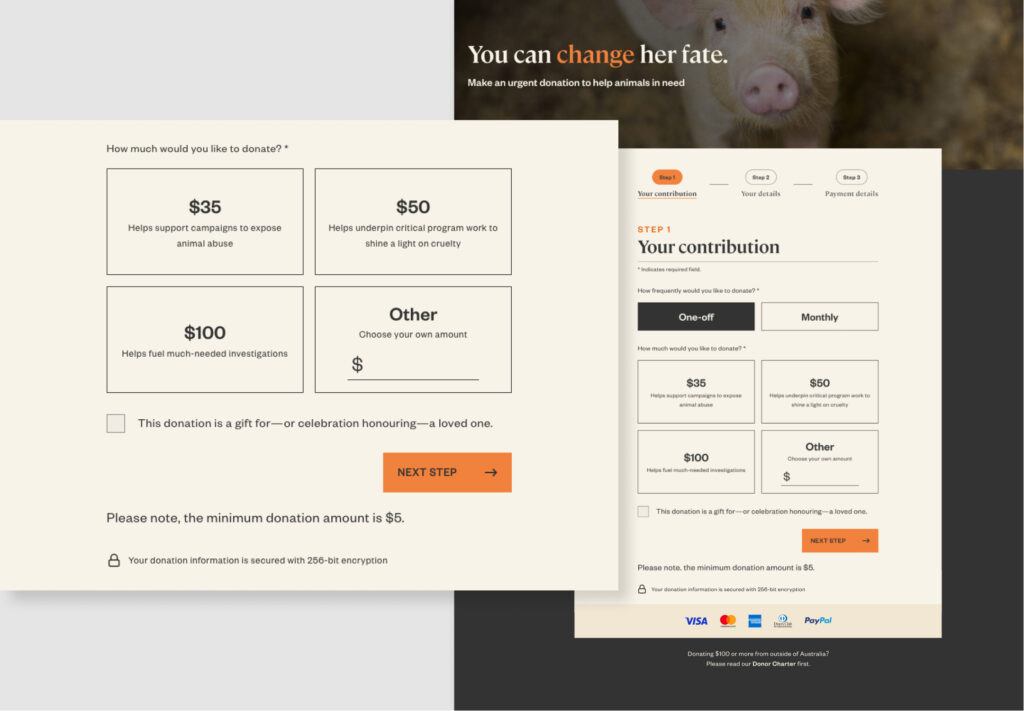
As you can see when you visit the Animals Australia main donation page, there’s minimal copy preceding the form itself, and what is there evokes a sense of urgency. When you scroll down to start interacting with the form, the main navigation bar is automatically hidden. At this point, the form is the only element on the page. There’s no floating footer, and you can only bring the navigation back by scrolling upwards.
There are also no inessential calls to action, either. No newsletter signup forms, and definitely no ads. The only pop up is an ultra-minimalist cookie acceptance button. There’s a link to the Donor Charter, relevant to people who donate more than $100, but it sits outside the form itself.
Only by scrolling past the donation form do visitors come across additional content—and it’s all related to alternative forms of donation.
Mozilla Foundation
Not-for-profit organisation, the Mozilla Foundation, most famous for its Firefox web browser, relies on ‘donations to carry out [their] mission to keep the Web open and free’. In fact, that’s exactly what they say on their donation form.
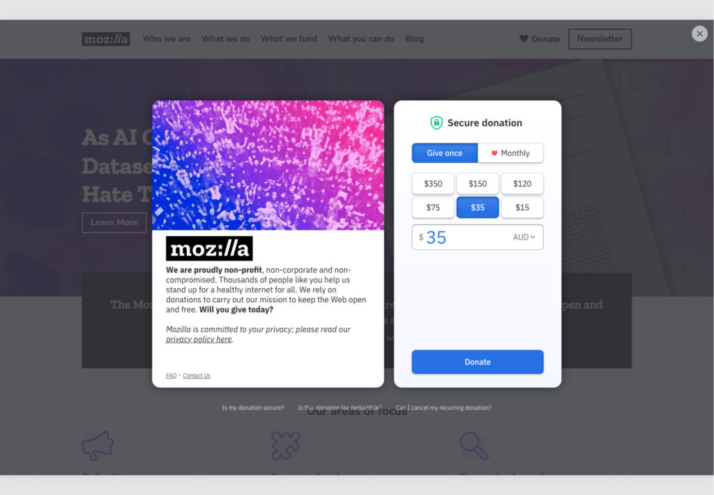
There’s not much more copy than that. And the form itself, which pops up over the top of the website, is almost completely free from distractions.
As a donor, the only options you have are to:
- Donate—by far the most prominent call to action on the page. There’s also an opportunity to choose from a one-off or monthly donation option, and to choose from various pre-set amounts.
- Find out more about donation via much smaller calls to action such as ‘read our privacy policy here’ and FAQs.
- Click out of the form.
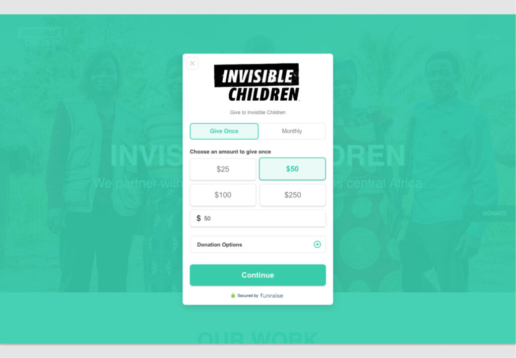
Invisible Children
Invisible Children, an organisation whose aim is to ‘partner with local peacebuilders across central Africa to end violent conflict’, has a form that works in a very similar way to Mozilla’s. In fact, the main difference is that it provides even fewer options.
This barebones page reduces cognitive load, which is a proven way of minimising task abandonment.
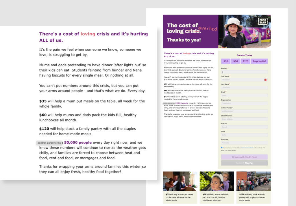
Foodbank Victoria
Foodbank describes itself as ‘the largest hunger relief charity in Australia’.
Their Victorian division’s donation page is slightly different to the examples above. You could argue there are distractions surrounding the form itself. But everything—every image and piece of copy—is directly related to donation, and aims to convey the importance of a donation.
There’s still no extraneous detail; only a concise outline of the challenge that the organisation (and society) faces, and the good that various donation amounts can do.
Removing distractions—part of a strong conversion strategy.
When people arrive at your donation page, you can assume most haven’t got there by accident. And you can also assume that their primary goal is to make a financial contribution. But you can’t assume they’re all going to donate as a matter of course. There are so many reasons why people abandon a process online.
One of those reasons is distraction. Elements in (or on top of) the page itself can easily direct a user’s attention elsewhere. And removing them, reducing them in number, or never considering them in the first place, often requires only modest effort on the part of a marketing team.
By eliminating annoyances like pop-ups; taking away headers and footers (that may be essential in other parts of the website); and making sure anything outside the donation form relates to persuasion, and how powerful a charitable gift can be, you help to narrow a supporter’s focus and reduce their cognitive load.
Of course, this is just one part of what might be your marketing team’s overarching conversion improvement strategy. That may also include simplifying the form itself, optimising for mobile, using clear language, clearly confirming form submission, and incorporating relevant visuals.
It’s one part, but it’s an important part.
We live in a world where our attention is split in dozens of ways all the time. Taking away even a few of the diversions, even the ones that may at first seem inconsequential, can make a significant difference.
More Articles
Up for some more?
Get your monthly fix of August happenings and our curated Super8 delivered straight to your inbox.
Thanks for signing up.
Stay tuned, the next one isn't far away.
Return to the blog.