
- |
- |

Whatever your industry, a website redesign project represents an interesting juncture for a brand.
As a brand manager, you’ll typically find yourself in one of two scenarios.
- In some cases, a website redesign will naturally follow in the wake of a brand refresh. You invest in a new, considered brand and it needs to be reflected in your website.
- In other cases, a website redesign project is the catalyst for a concurrent rebrand. Organisations think “we’re investing in building a new digital product, let’s test some assumptions and see if we can reinvigorate our visual identity in the process”.
Regardless of which camp you fall into, there are some key questions you should ask—both of your internal team and of any third-party designers working on the redesign project—to get the best possible result.
Question 1: what aspects of our brand are flexible? Which elements are non-negotiable?
This question encourages the team to thoroughly audit every aspect of your brand. Asked in the early stages of the project, it’s also a useful way to test how comfortable or experienced they are in assessing the individual brand elements—colour, type, photography, and more—and how suitable they are for digital applications.
Before you look at conceptual interface design, now is the time to check the accessibility of colours and typography. Inclusive design is paramount, and sometimes even a legal requirement, and digital applications can be unforgiving.
Some colours may need to be adjusted slightly to meet contrast requirements for legibility. Others may not be suitable in certain contexts; a primary colour in print applications might only work as a tertiary or accent colour in digital design.
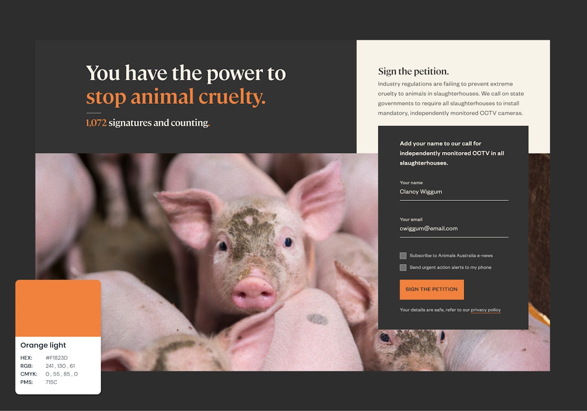
Although orange is a key brand colour for Animals Australia, it is used as an accent colour in their design system. This is because it provides a prominent point of emphasis within the interface, but also for accessibility reasons.
Now is also a good opportunity to look under the hood at your brand’s image library.
Poor quality or stock imagery can quickly erode first impressions of any brand. This is especially the case when contrived imagery conflicts with your fundamental brand principles.
For example, if it is important that your brand is authentic and connects with real people—a common consideration for not-for-profits offering social support or healthcare services—it’s problematic if all of your imagery features professional models with lens flares.
Authenticity is key to an organisation like Guide Dogs. Each of their state-based sites features real people in a prominent, local setting; this level of authenticity simply wouldn’t be possible with stock photography.
Beyond assessing the brand’s DNA, this is also a good opportunity to identify any brand conventions that may have unintentionally become concrete over time.
It’s not uncommon to hear statements like: “I actually don’t know why we have these colours, it’s just always been this way” or “one of the old designers created these abstract shapes and we kept on using them”. Now is the time to test assumptions, question the validity of certain design elements, and ensure everything reinforces the right strategic and conceptual objectives.
Other useful questions in relation to this theme:
- Will these colours work in digital applications? Will the contrast be high enough to pass WCAG guidelines? Do we need to be mindful of accessibility in delivering this work?
- Do our brand typefaces have any unique licensing issues or usage requirements? Which weights of typeface will work best for digital interfaces?
- What brand assets do we have available (graphics, illustrations, icons)? Which ones are suitable and worth keeping? Is there an established system of rules to ensure these applications are cohesive?
- How do visual elements amplify or communicate the brand mission?
Question 2: what adjectives would describe the personality we need to achieve? What are the qualities or values we should strive to convey in this specific application?
If you’ve completed a recent rebrand, you’ve likely been asked similar questions in some sort of workshop or exercise. If not, and your ideal brand was a person, how would you describe them? How do they make you feel?
- Are you contemporary and cutting-edge? Or classic and timeless?
- Are you playful or serious?
- Are you friendly or authoritative?
- Are you minimalist and clean or stimulating?
- Do these qualities exist on a spectrum, or are they absolute and binary for your brand?
- Is there any qualities that your brand definitely isn’t? Calling out definite exclusions can be just as helpful.
The answers to these questions will begin to inform a framework for creative concepts that resonate with different target markets .
Jean-Noël Kapferer, one of the world’s foremost thought leaders on branding, suggests that “brand personality fulfils a psychological function. It allows consumers to either identify with it or project themselves into it. Brand personality is also the main source of tone and style.”
If your brand personality is easygoing, friendly, accessible to everyone and sociable—like Fostering Connections—these traits might come to fruition as bright colours, rounded edges, and playful interactions.
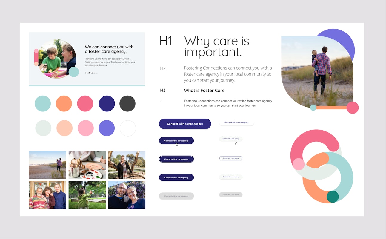
Fostering Connections use vibrant pastel colours and abstract shapes to convey a sense of youthful charm and optimism throughout their site, because these qualities align with their brand personality.
A brand personality based on luxury, prestige and high esteem—like Foresters Financial—will use different techniques.
Foresters Financial conveys a refined, prestige brand aesthetic through a muted colour palette and smooth, understated interactions.
For those who’ve already been through a similar exercise as part of a recent rebrand, think about the specific personality your brand needs to convey in the context of the website.
Many frameworks suggest brand personalities are fluid and exist on a spectrum. A brand personality indicates how your organisation will typically act or feel, but not how it always acts or feels.
For example, your brand personality might be slightly different in after-sales support compared to your website. This is because you’re dealing with customers at a different stage of their engagement and familiarity with your organisation.
Other useful questions in relation to this theme:
- How do we want people to feel when they arrive at the new website?
- What aspects of other sites resonate with what we hope to achieve? Why?
- In what context will people arrive at the site? What other interactions will they have with the brand, whether before or after visiting the website?
Question 3: where does the brand break? How far can we acceptably push the different personality traits of our brand, and in what combination?
Regardless of whether you’ve recently refreshed your brand or not, it’s valuable to encourage designers to go through a process of divergent thinking for digital design applications.
By asking ‘where does this brand break?’, you encourage designers to push different aspects of the brand, in different combinations.
For example, if it’s important to convey a sense of playful energy, dial design elements up and down in different combinations—shapes, colours, form, hierarchy, and texture—to push that sentiment as far as possible. What makes the brand feel too playful? Does the brand feel too serious or dull if certain elements are absent? Are there certain elements that make things feel too whimsical or childish?
The value of this process is two-fold:
1. It provides useful datapoints to determine how the brand should—and just as crucially, shouldn’t—come to fruition in different applications. This process forces you to test and validate existing brand conventions or helps in establishing new ones.
2. It ensures your design team explores a range of creative avenues to give you genuine choice in how the website’s design language comes to fruition.
In relation to this second point, we sometimes refer to the concept of a ‘spicy scale’.
Ensuring the spice is right.
Imagine you’re at a restaurant ordering spicy chicken wings. Ideally, the three options you choose from—‘mild’, ‘medium’ and ‘hot’—are genuinely differentiated from another. They’re not three different flavours of the same spice level, and therein lies the choice.
When design teams fail to explore divergent applications that test and push the established conventions of a brand, they deny you the opportunity to assess genuinely differentiated ideas for how your brand could be expressed. If all three options fall within the comfortable confines of an established visual language, there is no real choice. And that’s why you get Frankenstein concepts where people combine multiple ideas.
Even if you end up choosing something more conservative or traditional in style (something ‘mild’ on the spicy scale), there’s very little wasted work.
The lateral thinking done during this process gives you tangible examples of why certain brand conventions exist.
By asking your team to explore and find the conceptual breakpoints of the brand, you’ll either:
- discover exciting new applications or,
- refine existing rules for how the brand should (and shouldn’t) be handled.
Asking the right design questions can remove risk or set you on the path to award-winning innovation.
For brand managers, a website redesign project is inevitably a time of flux.
The old saying suggests you should ‘never waste the opportunity afforded by a good crisis’. Robust stability can come from periods of instability; a time of flux can pave the foundations for tomorrow.
In the same vein, asking the right questions at the right time can help you to consolidate every facet of your brand: from the technical through to the creative and conceptual.
If you want to dig deeper into any of these question, or have others that relate to brand, design, or anything marketing-related, we always love to chat.
More Articles
Up for some more?
Get your monthly fix of August happenings and our curated Super8 delivered straight to your inbox.
Thanks for signing up.
Stay tuned, the next one isn't far away.
Return to the blog.