Good microcopy: the marketing afterthought that creates a massive impact for NFPs.

- |
- |

Marketing teams in not-for-profits have a huge remit.
If you’re in design and content production, your interest is likely divided across:
- Writing and producing fresh website content, like campaign pages, news articles, media releases, event wrap-ups, and more.
- Conceptualising advocacy campaigns to elicit support on key issues.
- Developing eDMs, social media material, and other outbound content to connect with your supporters.
To make things more complicated, you may be creating all of these content types in a single day, with shifting deadlines, priorities and approvals processes.
So, it’s completely understandable that a seemingly minor consideration—something like writing microcopy—can fall by the wayside.
But the thing is, this supposedly tiny consideration can have a significant impact on contributing to your marketing goals.
How significant, you ask? This example highlights that a simple change in phrasing from ‘Request a quote’ to ‘Request pricing’ saw a 161.66% increase in clicks.
There’s research from Nielsen Norman Group that suggests well-structured website copy contributes to 124% better results in supporting people to achieve their goals.
The evidence is clear: when it comes to microcopy, a little bit of craft goes a long way.
What do we mean by ‘microcopy’?
According to this excellent overview from Anja Wedberg at UX Writing Hub, microcopy is: ‘the small text snippets that guide us through websites, apps, and other digital experiences. It comes in many shapes and forms, but it has a common goal: to help people navigate through a digital product or service as smoothly as possible.’
I’d add to that definition by suggesting microcopy always serves a functional purpose.
Unlike editorial copy (which is designed to articulate an idea or perspective on an issue), or branding copy (which intends to elicit an emotional response in relation to a product, service or concept), microcopy is all about supporting people—or getting people—to do something.
Microcopy comes in the form of:
- Call-to-action (CTA) buttons throughout a website, eDM, or social media campaign.
- Donation handles in online donation forms (for those unfamiliar, the suggested dollar amounts you can contribute when selecting how much you’d like to give).
- Error or success messages in forms: for example, a newsletter signup form.
- Loading messages that tell you something is happening in the system.
- 404-pages.
In each of these applications, there are specific techniques non-profit organisations can use to increase the likelihood someone will complete a desired action; whether it’s to donate, sign-up to a mailing list, volunteer, support a petition, or anything else.
Use action-oriented words.
Why? Well, it’s called a ‘call-to-action’ for a reason. You’re trying to incentivise someone to act.
Most people who visit your site or view your collateral—whether they’re long-term established advocates or newly discovering your mission—will feel some level of personal association with your cause. That’s why they’re reading your content.
By using passionate action-oriented language, you will either:
- Mirror their own existing energy and enthusiasm, or
- Nudge them from consideration towards full support.
When you write conversion-focused microcopy, always start your CTA with a verb. This makes it clear what action the person triggers by clicking the button.
As an additional tip, provide some compelling pre-text in close proximity to the CTA. Like this example below, from Sea Shepherd.

Sea Shepherd’s ‘no fishing’ campaign website features some compelling microcopy.
The pre-text is particularly compelling here because it subtly positions the reader as being the central actor in creating change. By simply clicking the button, you become the hero of this story.
‘If nothing is done, there won’t be anything left’. Psychologically, there’s an unspoken implication: those who don’t ‘take action’ are comfortable doing nothing, and complicit in the slide towards a future where there’s nothing left.
So, will you do nothing? Or will you click the button?
This leads perfectly to the next technique…
Tell a small, emotive story with your microcopy.
Why? As a non-profit, your mission is crucial. It’s how supporters connect and align themselves with your organisation.
Your story is your secret weapon: you should find opportunities to reiterate your mission in every facet of your website. This will reassure your supporters of why they’re here and highlight their importance in facilitating crucial impact.
It doesn’t have to be overt or overdone. A simple nod is enough.
For example, research suggests many of Guide Dogs’ donors are motivated to support dogs and puppies in training, so the dollar handles in their donation form (see below) reiterate how different contributions provide value for the dogs in different ways.
Beyond microcopy, the animated icons are a nice touch that helps with storytelling, eliciting an emotional response, and driving conversions too.
Animated dollar handles in one of Guide Dogs’ donation forms.
Jai Dog Rescue, an organisation devoted to transforming the lives of street dogs in Thailand, have an ever-present ‘donate’ button that tracks down the right-hand side of their homepage. The microcopy here reiterates the organisation’s valuable work, while perfectly aligning with the likely motivation of most people visiting the site: ‘100% of your donation is spent on what matters most: transforming lives of dogs in need’.
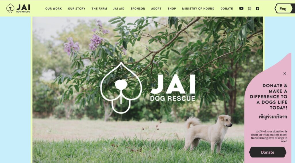
Jai Dog Rescue uses microcopy to reiterate its mission for prospective donors.
The Royal Women’s Hospital includes some incredibly compelling stories in their donation form. These stories not only reiterate the value of your potential contribution, but serve to spark a deeper emotional connection to different causes that may resonate with donors.
Microcopy in the Royal Women’s Hospital’s donation form.
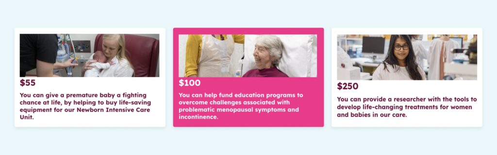
The National Breast Cancer Foundation uses a slight variation on this theme. While there’s no microcopy directly against each dollar value within the donation form, there is supporting material to describe the types of research a donation will fund. The point is there’s a narrative component associated with the function of donating, which connects back to why taking action is important.
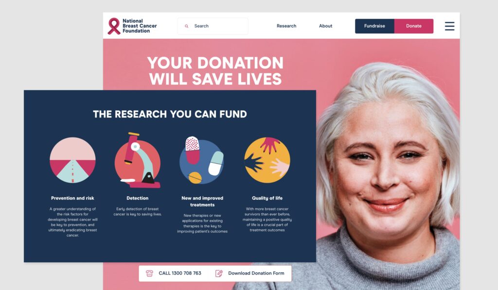
The National Breast Cancer Foundation highlighting the impact associated with donations.
Here’s another example from Animals Australia (please note, some people may find imagery in the link distressing). This is a call-to-action encouraging people to send a petition that calls for an end to live export.
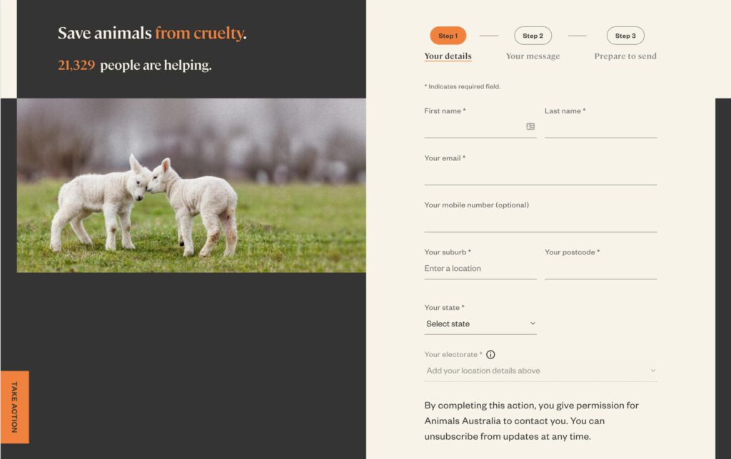
Animals Australia uses microcopy to express the core emotional message of the call-to-action.
Rather than simply highlighting the functional intention of this form—‘Sign our petition’—Animals Australia uses microcopy to articulate the ultimate emotional proposition that underpins the action behind the form: ‘Save animals from cruelty’.
This approach connects more with the motivations of the supporter, is far more meaningful to them, and is significantly more likely to drive the desired action.
There’s also this example on a 404-page from Jesuit Social Services. The typical function of a 404-page is to simply indicate there is no corresponding page within the domain of the website you’re on. Basically, you’ve hit a dead end and the page you’re seeking doesn’t exist.
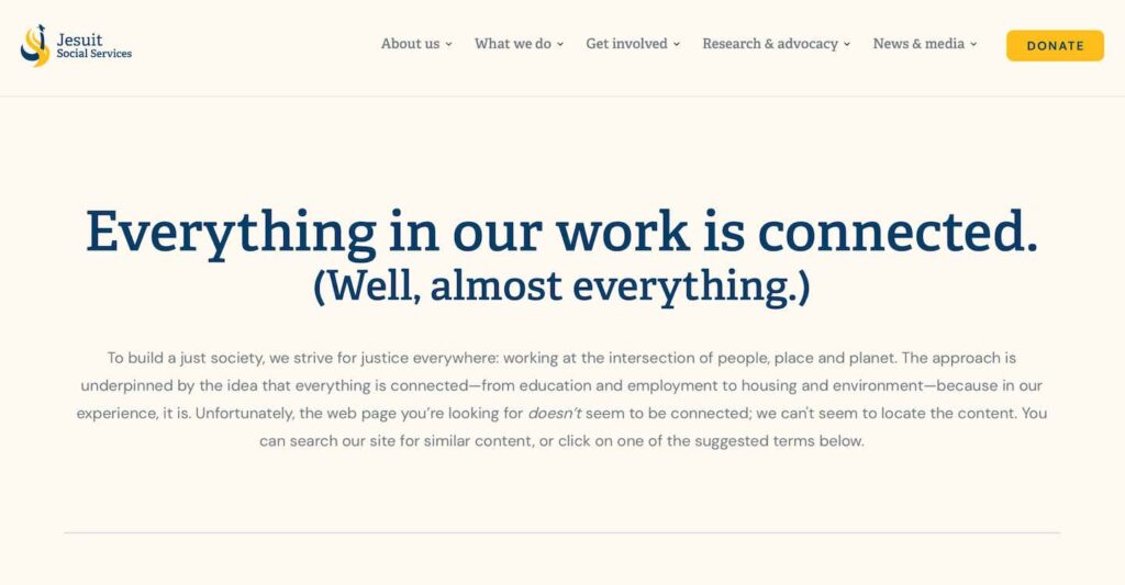
Jesuits Social Services uses its 404-page to tell a story.
Jesuit Social Services use the messaging on its 404-page as an opportunity to reiterate its mission. Through the power of a nicely crafted micro-story, this approach turns a potentially negative experience into a surprise moment of delight: providing a chance for people to learn more about the organisation’s mission and purpose.
Be hyper-specific.
Why? This one pertains to accessibility. Specificity of labelling is an important consideration for accessibility, among many other factors.
By labelling buttons and call-to-actions with some clue as to the function of that button—like ‘learn about our services’ rather than simply ‘learn more’—you can provide more context for people with different abilities, like low vision, blindness, or variance in cognitive ability.
This is important; in a hyper-competitive fundraising landscape, your website needs to connect with and support as many people as possible.
As an added bonus, it’s a small thing that can contribute to a feeling of trust and transparency. Also, the more descriptive you are with button labels, the more likely you are to find opportunities to allude to the narrative of your mission (see the above point about small, emotive stories).
Below is another great example from Guide Dogs. Rather than relying on a single general catch-all like ‘see our services’, each of these buttons speaks to a very specific goal or impulse that aligns with the motivation of the visitor. Of course, ‘see all services’ is still there for those that want to see a full list of everything.
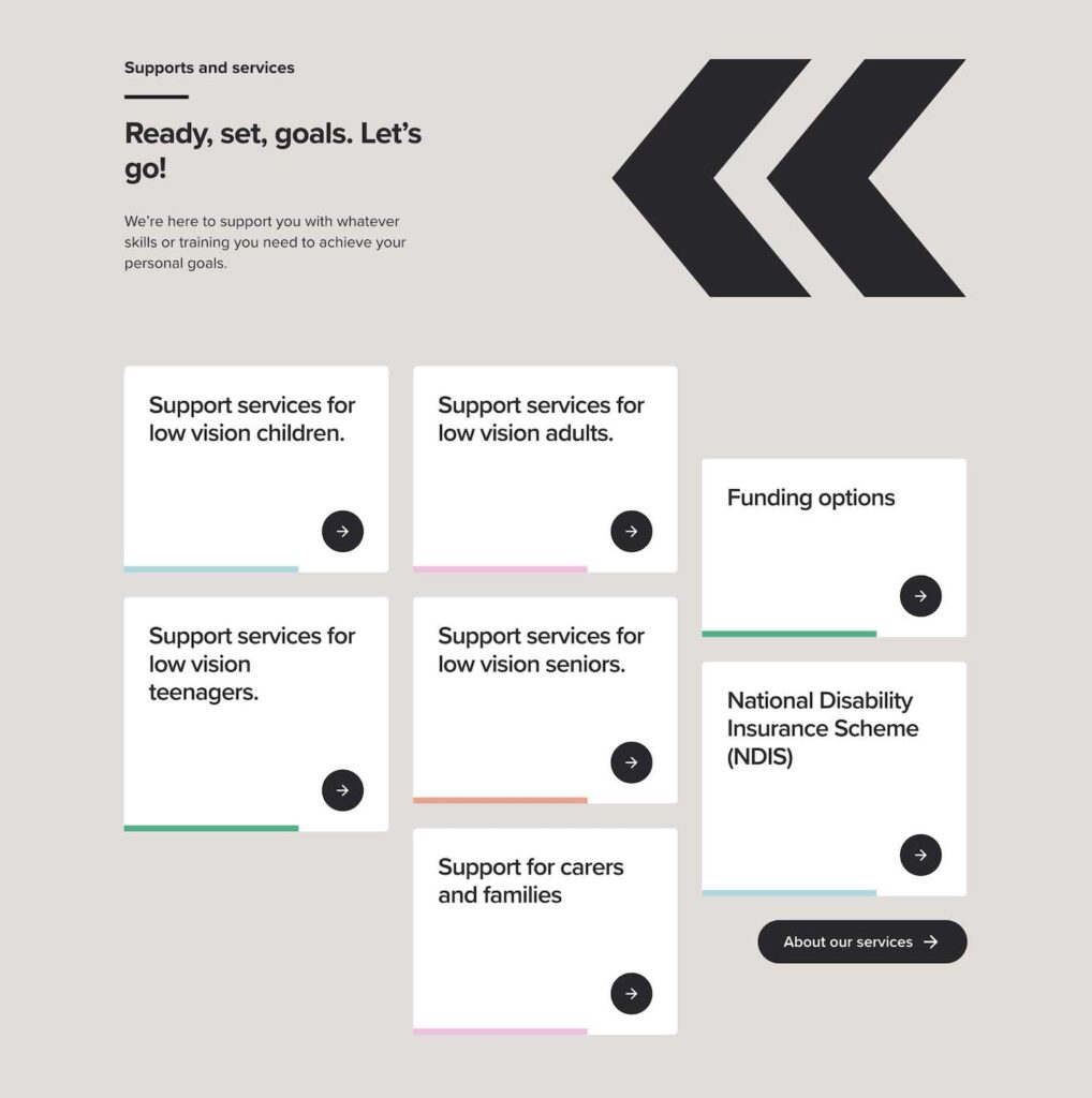
Guide Dogs’ CTAs for services speak to different impulses and goals.
On the Critical Danger website, which raises funds and awareness for charities supporting critically endangered animals, minimalistic CTAs are dotted throughout the single page site experience.
Although the CTAs here are small, they find ways to command attention.
Nestled among gorgeous photography and some nicely crafted animations, the CTAs are incredibly specific: ‘Visit the IUCN Red List.’ In addition to the benefits highlighted above, there are elements of education and curiosity at play here too. What is the IUCN list? What animals are on the list? What additional information does the list offer? For such a small CTA in the context of this site, it provides multiple incentives for your click. ‘Read more’ simply doesn’t provide the same value.
Make it consistent and clear across multiple touchpoints.
Why? There might be multiple steps in eliciting a conversion.
You may have social media ads, paid search, or an eDM campaign that links through to a conversion-focused landing page.
Whatever the steps involved in getting people to your site and encouraging their support, you’ll have a better chance at success by making it as easy, consistent, and clear as possible at every point of the journey.
Without clear signals guiding people toward the next step, you run the risk of drop-offs at each point in the process.
In the examples below, it’s perfectly clear that you’re about to provide support for Animals Australia’s ‘Be their Hero’ campaign as you transition from the eDM to the landing page. There’s clear consistency in the language so you immediately know you’re in the right place and how to contribute after clicking on the email CTA.
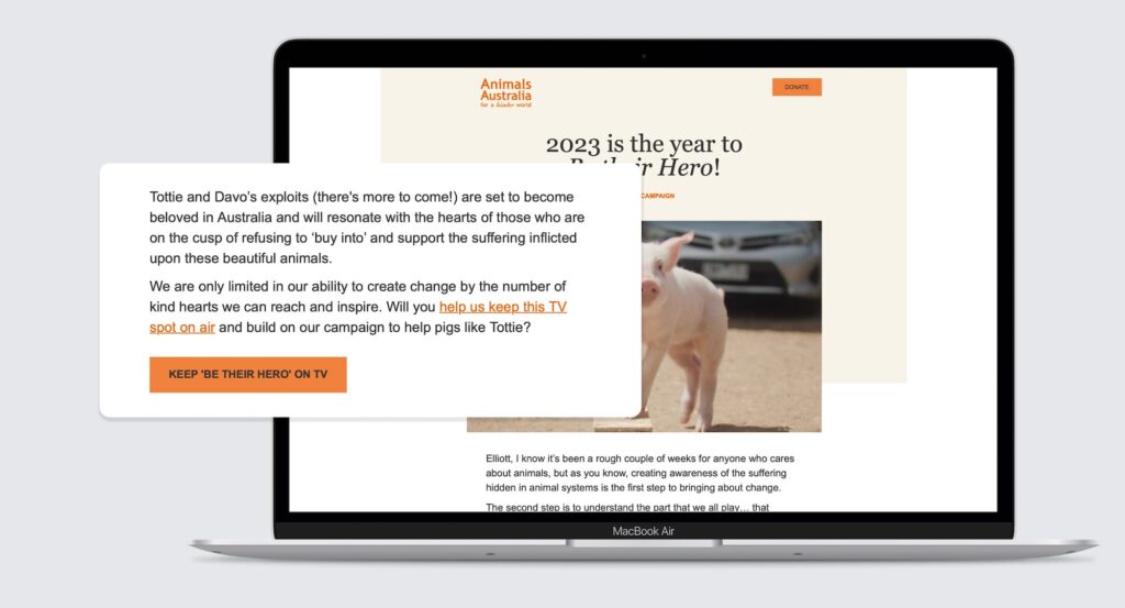
The click-through CTA in the email invites readers to ‘Keep ‘Be their Hero’ on TV’…
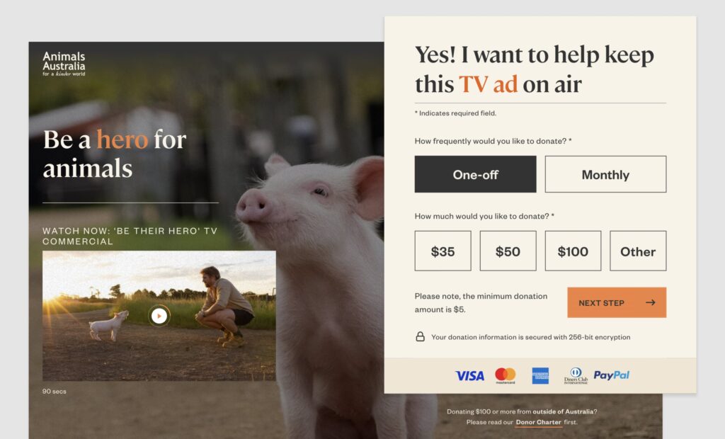
Before the landing page clearly encourages people to join and support the cause: ‘Yes! I want to help keep this TV ad on air’.
How do you know if it’s good microcopy? Test it.
Writing in accordance with these principles will help you craft better microcopy. But the best—and in fact only—way to establish whether it’s ‘good’ or not is to test it.
Remember, microcopy should serve a functional purpose; it should encourage a conversion. With that in mind, we can use A/B testing to hone the efficacy of microcopy in various instances throughout a website or campaign.
In an A/B test, we might write two donation CTAs for Guide Dogs:
- Give now and support Guide Dogs in training
- Play a crucial role in supporting puppies
We can then send a portion of traffic to one CTA and a portion of traffic to the other, measuring which one has the higher conversion rate. We might establish that 1-in-6 visitors will donate to the first CTA, while 1-in-10 will donate to the second.
You should always continually test and optimise your microcopy based on analytics, to ensure the most impactful approach possible.
Does your microcopy miss the mark?
If you’ve never thought about microcopy in this level of detail, you could be leaving value on the table. The great news? It’s never too late to write good microcopy. There are simple things you can do right now to capitalise on improved conversions.
- Encourage action.
- Tell a story.
- Be hyper-specific.
- Make it consistent.
- Test and validate.
There’s plenty more beyond that too.
For the time being though, let’s stay true to the focus of this article: Get the small, simple things right and you’ll start to unlock serious value.
More Articles
Up for some more?
Get your monthly fix of August happenings and our curated Super8 delivered straight to your inbox.
Thanks for signing up.
Stay tuned, the next one isn't far away.
Return to the blog.