
- |
- |

This is the second article in a series on cognitive load and corporate communication.
As we mentioned in our first article, cognitive load refers to the amount of mental effort or resources required to perform a task. The human mind has limited processing power, and when information puts that facility under exertion, understanding and retention become far more difficult.
What’s that got to do with marketing?
Because every website, brochure, billboard, and annual report has an objective. And no matter what it is – no matter what the communicator and the reader want from the information – that objective becomes far less likely to be fulfilled when the cognitive load is too high.
In short, cognitive overload is a big potential barrier that stands between your corporate communication and your audience’s ability to act on it.
But the good news is that there are numerous ways to lower the hurdle. Or even remove it completely. In this article, we’ll talk about just one: selecting and implementing images.
Why image selection and placement are so important
One of the world’s leaders in user experience research, Nielson Norman Group, has suggested that there are three main ways to reduce cognitive load and make web content easier to read. All of them are relevant to images:
1. Avoid visual clutter.
Research tells us that you can reduce cognitive load by removing what’s not totally necessary. It’s a bit like tidying a room. But instead of removing dirty socks, half-eaten apples, and empty soft drink bottles, we’re getting rid of digital elements that only serve as a distraction.
Or, as Nielson Norman Group puts it, “irrelevant images slow users down”. However, it’s important to remember that “meaningful” images remain “valuable design elements”.
2. Build on existing mental models.
We all reduce cognitive load by falling back on what we know, the stuff that we’ve already committed to long-term memory. An example of this is building mental models, sophisticated expectations of how something like a website should work based on our experience clicking around the internet.
“When you use labels and layouts that [users have] encountered on other websites, you reduce the amount of learning they need to do on your site.” Images play a central role in such layouts.
3. Offload tasks.
It’s very likely that whatever piece of communication you’re creating, it will ask your audience to read, copy, remember information, and even make decisions. All of these actions make a demand on your reader’s mental processing resources.
You can offload such tasks by offering an alternative – and Nielson Norman Group specifically mentions images as one substitute.
“You won’t be able to shift all tasks away from users, but every task you eliminate leaves more mental resources for the decisions that truly are essential.”
So how do use images to declutter, appeal to mental models, and find alternatives to challenging (but not crucial) tasks? Australia’s leading provider of vision services, Guide Dogs, gives us an excellent example in the form of their carefully designed annual reports.
How you can use images to minimise cognitive load.
You can’t create a piece of communication thinking about cognitive load in isolation. There are so many additional considerations to factor in: branding, medium, intended audience, organisation type, and accessibility, to name just a few.
Guide Dogs is a particularly good case study because it has created annual reports that have balanced these competing priorities over the past several years. They have minimised cognitive load while:
- Adhering to updated national brand guidelines.
- Presenting an authentic and relatable style, staying clear of extremes: over-polished at one end of the spectrum and untidy at the other.
- Ensuring the reports remain precisely what stakeholders expect them to be: a reliable and substantive repository of information on the organisation’s performance and achievements.
- Making sure that the reports are highly accessible, understanding that many stakeholders have low vision.
In fact, the documents have been so adeptly designed that the 2021 NSW/ACT Guide Dogs’ Annual Report was awarded a Distinction in the 2022 Australian Graphic Design Association (AGDA) Awards’ Publications category.
What can we learn from how Guide Dogs designed its annual reports?
Here are four key tips:
1. Use images to accompany the copy, and orient the reader…
…and declutter in the process.
Not all images get in the way.
Such advice may seem self-evident, but when you’re concentrating on decluttering, you can easily fall into the trap of thinking that images are a luxury. Or even an extravagance.
But stark austerity can be just as unhelpful as a glitzy muddle.
As UI expert Max Steenbergen wrote in UX magazine:
“Eye candy distracts, whereas bare-bones fails to attract… If the application doesn’t have some kind of aesthetic value, it will not only fail to attract the user’s attention, it will also fail to hold the user’s attention.”
Like much design, it’s about finding a balance – eschewing the “irrelevant” and retaining the “meaningful”. But how do you make those judgements about images?
Well, in multiple ways, but one of the most useful is determining whether an image complements copy. This has been a key consideration Guide Dogs designers have taken into account as they’ve created the reports.
As we’ve discussed, by convention, an annual report provides substantial information. Much of that information is conveyed in words, and the risk there is that vast slabs of copy by themselves can be daunting. That can lead to cognitive overload.
However, this introductory section of the 2021 Victorian report has no daunting wall of writing and no sense of clutter. Instead, there’s a neat balance of words and images. Together, and in true Guide Dogs style, they orient the reader, establishing a kind of digital ‘front page’ from which you can navigate or scroll.
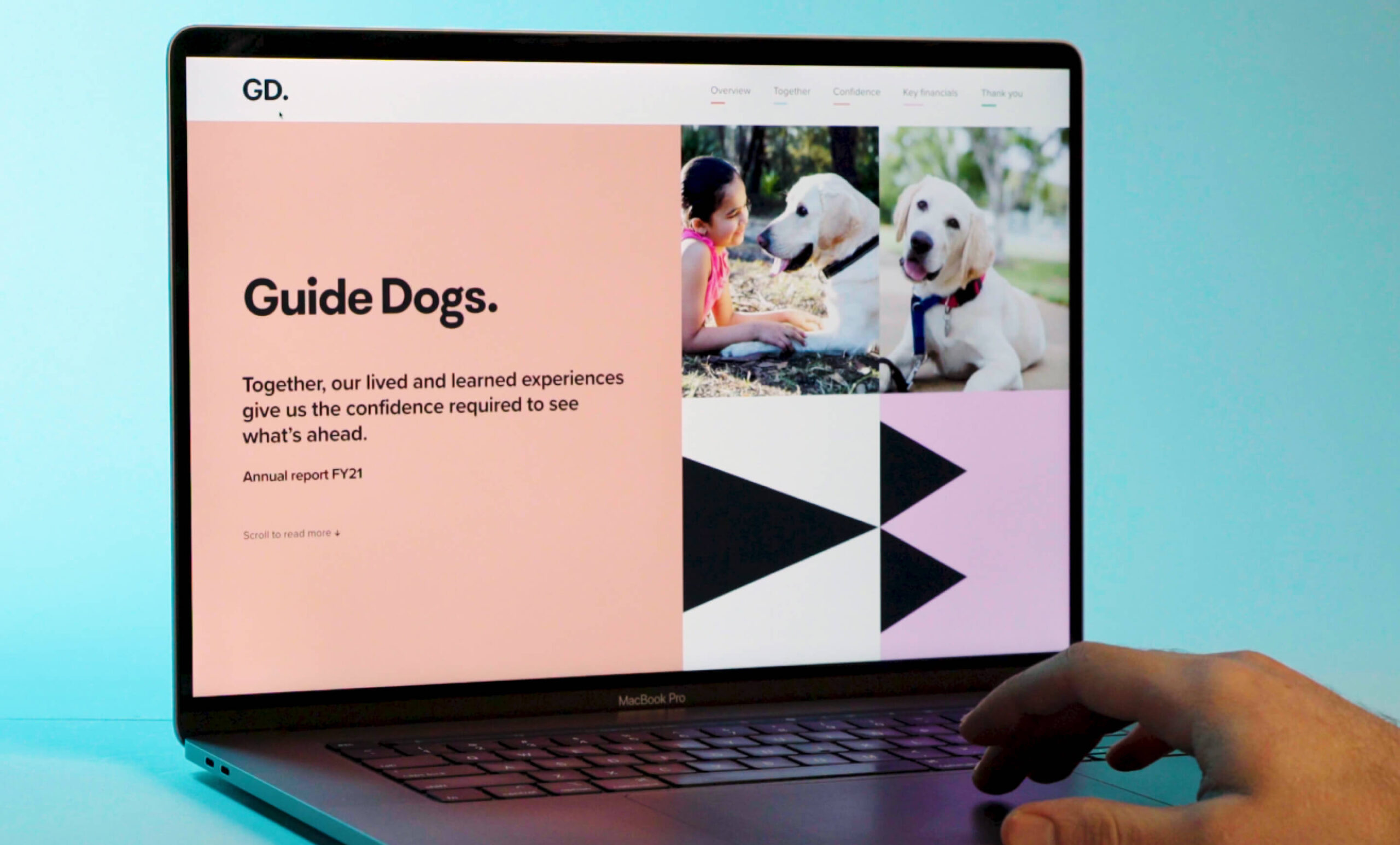
Each of the five main sections begins with a digital contents page, and the image is there to reinforce the brand without pulling attention away from the four sub-section links.
The design also maintains visual variety, occasionally moving away from photography and brand patterns, but only when the image supports the reader’s understanding of the copy.
In the section highlighting the organisation’s values, each pillar is paired with a simple line drawing that speaks directly to the copy.
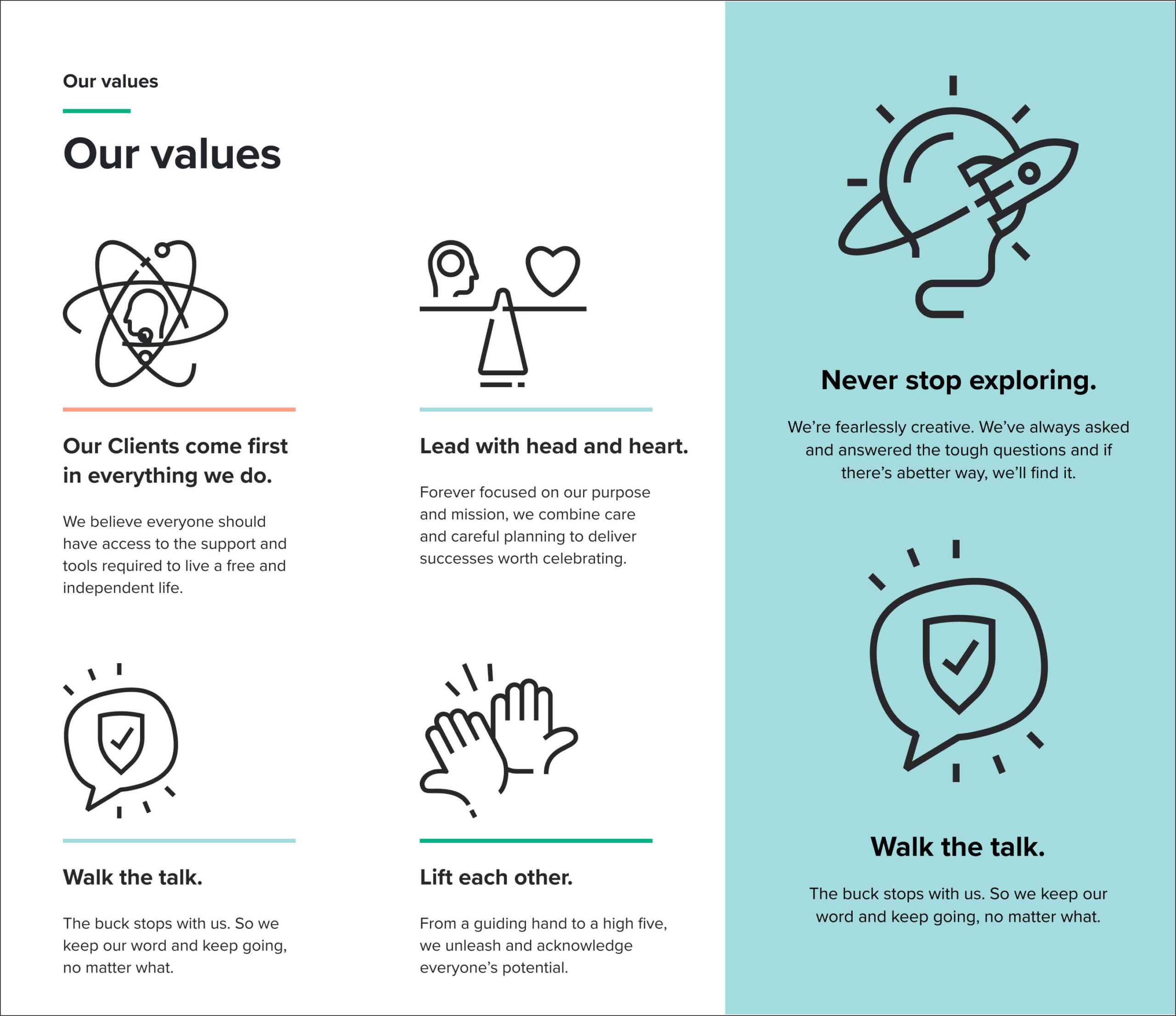
Again, the images complement the copy. And, because we know from Richard Mayer’s multimedia principle that “people learn better from words and pictures than from words alone”, they likely make information retention easier.
2. Use images to help readers offload tasks.
What do you expect to be included in an annual report?
If you answered financial information, a summary of the year, or messages from leaders, you wouldn’t have been on your own.
But what if one of those elements created precisely the clutter you sought to avoid? Would you remove it entirely?
It may seem logical, but it’s fraught. Breaking radically from conventions can confound a reader’s mental models and make any piece of communication more difficult to consume.
So what’s the alternative?
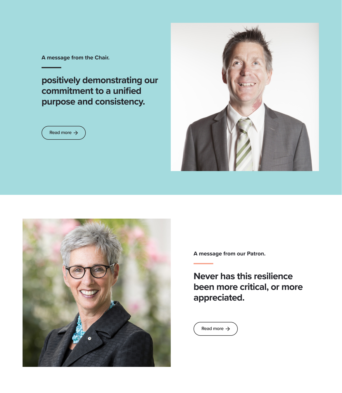
Let’s take a look at the ‘A message from our Chair’ section as an example. It’s basically obligatory in any not-for-profit document of this kind. Guide Dogs knows this, so the message hasn’t gone anywhere. But it has changed in format. And an image has played a central role in that shift.
In previous reports, a reader could scroll down the report and would come across the Chair’s message as an unabridged digital ‘letter’ to readers. It was a lot of copy all at once, which was fine if you were looking for it specifically. But for someone browsing the report, it risked creating cognitive overload.
In later iterations, the copy remained but not as a default, immediately viewable element of the Overview section. Instead, a reader had to choose to open it. Where the full message itself had once been, there was a module that incorporated a small excerpt from the Chair’s message, an image of the Chair, and a call to action: “Read more”.
The copy-image combination was designed to pique curiosity but not get in the way as the full text had done in earlier reports. It was a classic case of task offloading, removing the need for the reader to consider the message in full and decide for themselves whether the task is one they’re willing to undertake.
Of course, not every reader will have their interest sparked by every image. But that’s OK. A subtle cue can be just as effective as a visual enticement.
3. Use images to create flow.
Cognitive overload doesn’t always lead to abandonment of a task. A persistent reader might continue through a piece of communication despite having difficulty processing its central messages. And that can lead to misunderstanding, or frustration, or simply a lack of enjoyment.
It can also lead to a reader getting stuck, stopping them in their tracks not because they’ve found something fascinating but because poor design results in a stop-start experience.
Images can help make a substantial document or website easier to move through, mitigating this potential problem.
As part of the Guide Dogs rebrand, it adopted a graphic palette of patterns designed to create a sense of movement and direction, underscoring that its services help clients move with confidence and independence.
The patterns’ use throughout the annual reports is an example of design that adheres closely to a brand while minimising cognitive load.
As you move through any section of the report, the patterns break up copy, statistics, and other images, while acting as a subtle, meandering guide through the content.
Retaining the substance while reducing the reader’s effort.
Corporate communication sometimes needs to include a lot of information – an annual report might be considered inadequate or insubstantial if it’s light on copy.
While it may not be possible, or desirable, to make wholesale copy deletions, there are numerous ways to make it easier to read. And as the Guide Dogs examples shows, images can play a critical role in that.
When carefully chosen and paired with copy, images can help to reduce a reader’s cognitive load and so make potentially critical information easier to process, reducing misinterpretation, increasing engagement, and minimising the possibility of a reader walking away from a piece of communication entirely.
More Articles
Up for some more?
Get your monthly fix of August happenings and our curated Super8 delivered straight to your inbox.
Thanks for signing up.
Stay tuned, the next one isn't far away.
Return to the blog.