What elements do NFPs need in a design system to promote consistency across teams?

- |
- |

If you’re a senior marketing leader in a charity or non-profit, you’ve got a lot on your plate.
You oversee all kinds of marketing initiatives across a huge range of channels. You connect and engage with younger donors on digital mediums, but also long term supporters who still love paper-via-post.
You navigate a hyper-competitive fundraising landscape. You manage multiple teams. Or at the very least, multiple designers, content producers, and marketers within your team.
You need to minimise inefficiency and create highly effective collateral that’s consistently on-brand.
And you need to do it all at once.
Or do you?
A well-structured design system can do some of the heavy lifting for you, by ensuring everything your team creates is on-brand, aligned, and based on proven best-practice.
Crucially, this frees you up to focus on more strategic, high level marketing initiatives, rather than in-the-weeds execution.
First up: what’s a design system?
There are many, many articles covering this topic if you’re keen to learn more. Here’s an excellent introduction from Will Fanguy at InVision.
In short, a design system is part brand style guide and part functional tool. It offers a series of modular components and flexible building blocks that are used to represent your brand across a variety of applications. Importantly, it also provides guidelines for these applications.
The more important consideration—and the focus of this article—is the specific elements you need within your design system to ensure consistency across your teams.
1. A compelling representation of your mission statement, brand values, and brand personality.
Why?
As a not-for-profit, your mission is crucial to the success of your marketing activity. Everything should revolve around it.
Your mission gives your brand an underlying credibility and purpose. It’s what resonates most powerfully with your supporters or members.
All creative expressions of your brand should align with and reiterate your mission. As a result, it’s crucial that it’s highly visible as part of your design system.
What benefit does this provide?
Alignment is critical for consistency.
Your mission provides the nucleus of purpose that will inform every piece of design your teams create. Working in conjunction with brand values and brand personality, it helps ground the ‘why’ behind every design decision, both minuscule and major. It provides a north star for your team.
Representing your mission also ensures the design system functions as a useful on-boarding tool for new designers and marketers. It orients new team members by articulating a sense of purpose, while offering constraint so that new team members don’t experiment or deviate from established, proven styles.
The more you reiterate the overarching mission and the personality of your brand, the less chance people will create things that aren’t appropriately aligned.
What does it look like in a design system?
There are many ways you can effectively embed a sense of organisational purpose into your design system. Animals Australia use two approaches. They both articulate their purpose and mission explicitly, and make animals centre stage through videos and big, bold photography featured throughout the design system.
The dignity and beauty of the natural world is centre stage; a reminder that everything the team creates should align with that overarching proposition.
2. Clear guidelines with detailed best-practices for practical application.
Why?
Your design system is a functional tool. It’s essential that it offers clear utility for multiple teams.
An effective system will act as a one-stop-shop, highlighting how the team should treat and use every aspect of your brand. Everything from the images you select to interaction states and how they animate.
If people have questions about the brand and how it comes to fruition—’What are the hex codes for our core brand colours? Is there a checklist of things we should test when designing eDMs?’—they should find the answers in your design system.
What benefit does this provide?
There are many.
Ensuring teams have easy, universal access to practical guidelines eliminates the need to re-think application rules on a daily basis. In turn, this removes potential variance in marketing outputs, especially when working with large teams.
The knock-on benefit? Senior team members don’t have to consistently reiterate fundamentals or suggest revisions.
By pointing people to the design system first, senior team members are free to think about more strategic, high level design decisions.
What does it look like in a design system?
There are many examples. Animals Australia include an email preparation checklist within their system to ensure best-practice techniques are always on-hand. This includes visuals of a best-practice design, along with things to tick off while preparing your email.
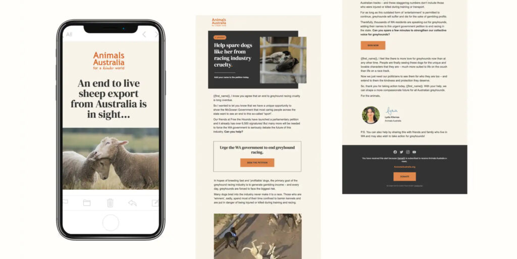
A visual example of a well-designed email, which has been created in accordance with brand guidelines.
Some of the best-practice configuration tips—unique to Animals Australia, but which you can apply yourself too—include:
- Personalisation increases open rates. Where possible, use personalisation to address people by their first name.
- Ensure call-to-action buttons are clear and visually distinct within the email—don’t make people think twice. Ensure any ‘ask’ is clear and concise so that people know how to contribute, why it’s crucial they contribute, and where any button will take them.
- Avoid putting important text or headlines into image assets within your email. Many email clients don’t load images automatically and incorporating text into imagery can mean that key messages and information is lost. Your email should be just as effective with imagery as it is without it.
3. Descriptive rationales as to why certain application guidelines are in place.
Why?
Rules are always more effective when you can rationalise why they exist.
To that end, it’s helpful to ensure the elements of your design system have a ‘so that’.
‘We use muted colours so that our design and brand assets reflect the maturity and high standing of our organisation.’
What benefit does this provide?
This offers a dual benefit: it reinforces the importance of your application guidelines while educating team members.
Google’s extensive design system offers detailed rationales for the pace of easing in animations.
‘In the physical world, objects don’t start or stop instantaneously. Instead, they take time to speed up and slow down. Transitions without easing look stiff and mechanical, while a transition with easing appears more natural.’
What does it look like in a design system?
Here’s an example from Google’s Material Design system.
4. A comprehensive mix of high-level direction and granular specificity.
Why?
Your brand is a living proposition.
Inevitably, your teams will use design systems to create assets for new applications as your objectives evolve and scale. That’s the very purpose of the system.
There will never be prescriptive guidelines offering absolute clarity for every potential brand touchpoint.
In a single day, your teams might create:
- A conversion-focused landing page within your website.
- An emotive eDM to recruit volunteers.
- Celebratory social media posts thanking your donors across multiple channels.
At the same time, you likely have teams with an eye on new initiatives. They might be:
- Building a new ecommerce store within your website.
- Creating a new series of campaign videos or TV commercials.
- Developing creating themes for in-person events, like fundraising drives or giving days.
It’s unrealistic to expect that a design system will offer exacting, comprehensive instructions for every possible brand application, both now and in the future.
As a result, the system should provide clarity on the overarching feel and sentiment that designs should achieve, with granular insight into the flexible molecular brand elements that constitute designs.
What benefit does this provide?
Imagine you’re building a house. The builder has laid out a range of individual components, with standardised shapes and sizes. For example, some of the components might include taps, light switches, doorways, and sinks.
It’s important to note, these are not the raw materials—like bricks, plaster or insulation bats—but functional building blocks that can be used in combination to create rooms.
The builder can combine these ‘blocks’ in many different ways. For example, taps and sinks could be used in a bathroom or a kitchen. Light switches could be used in the garage or the bedroom. We might have two different styles of taps—one more utilitarian, for the laundry as opposed to an en suite—but they still look similar and cohesive. This provides familiarity and consistency of context; wherever you are in the home, you know what a tap looks like and when and why you’d use it.
Similarly, a design system has standardised components (and guidelines for how to use those components) that combine to create a consistent, cohesive visual language for brands and products.
In the context of a website rather than a house, we might have buttons, donation forms and image galleries instead of taps, sinks and light switches. But the fundamental concept is the same: you can combine a selection of components to build unique pages for different needs throughout your website and beyond.
Teams have the flexibility to be creative and tell multiple brand stories, while ensuring system and cohesion across everything you produce.
What does this look like in a design system?
This flexibility comes to the fore as a combination of ‘atoms’, ‘molecules’ and ‘components’. Different organisations may use different labels, but the idea is the same. For more on this concept, read Brad Frost’s Atomic Design Methodology.
Animals Australia use ‘elements’ and ‘modules’ in their design system.
Elements look like this:
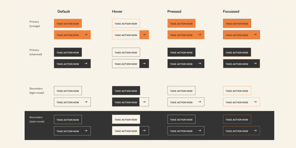
Think of elements as digital DNA. They provide consistency and efficiency for teams at scale. With a detailed catalogue of reusable elements, you don’t have to rethink the design of a button or form field every time you need one. This consistency of convention is an important heuristic for effective user-experience too.
Modules look like this:
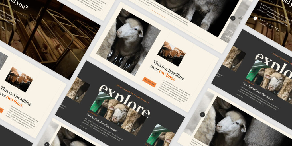
Modules are the building blocks you can use to spin up new content pieces, web pages, and more. Modules can include multiple elements; you’ll see there are buttons included within modules.
Crucially, modules can be coded directly into your content management system, so that you can spin up new web pages in any combination of modules you need. This reduces your reliance on developers, while again providing the perfect balance of flexibility and consistency.
Systems bring order, order brings efficiency. And an efficient team frees you up to focus on impact.
Organisational theorist and management pioneer Russell Ackoff once said: “a system is never the sum of its parts; it’s the product of their interaction.”
This certainly rings true for the power of design systems.
While a design system is a combination of guidelines and building blocks, the real value is that it empowers you to build.
Build more efficiently, to a higher quality, across many teams. Ultimately, that means you deliver more value for your organisation, and more progress towards your mission.
Everybody wins.
More Articles
Up for some more?
Get your monthly fix of August happenings and our curated Super8 delivered straight to your inbox.
Thanks for signing up.
Stay tuned, the next one isn't far away.
Return to the blog.