Building trust: the role of website design in conveying credibility for member-based organisations.

- |
- |

Imagine you’re standing on the street and someone asks you for a small favour. ‘Can you tell me the time?’ Sure. Then, immediately another favour: ‘can you mind my luggage for 30 minutes while I meet an old friend?’
Imagine the person then asks you to carry their luggage upstairs to an address in an apartment building.
At what point would you feel obliged to stop and ask for some sort of validation for these favours, whether personal contact information, money, or something else?
Now, ask yourself the same question, but instead of standing on the street, you’re using a website for the first time. Instead of asking you to mind some luggage, the website asks for your email address. Then prompts you to make a donation or buy a product.
If you feel uncomfortable at any stage in this escalating series of requests, there’s a clear reason why. And it’s all to do with trust.
The pyramid of trust.
The Nielsen Norman Group—a UX research and consulting firm trusted by leading organisations to provide a reliable guide on best-practice user experience—has developed a ‘pyramid of trust’, adapted from Maslow’s hierarchy of needs.
The pyramid looks like this:
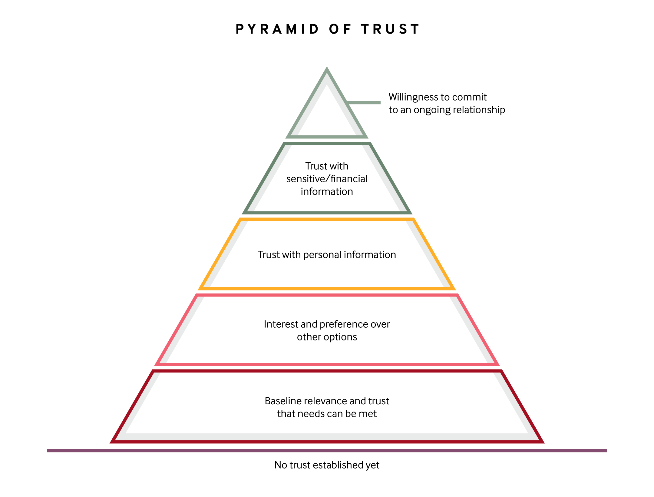
The pyramid of trust highlights the stages people need to move through in order to build trust with an organisation.
In describing the pyramid, Neilsen Norman Group offers the following: ‘establishing trust, whether with a stranger or on a website, is a gradual process. As the relationship progresses, skepticism is overcome, the comfort level increases, and new demands can be made. The relationship evolves through different stages of commitment, each built on top of previous ones.’
‘To stretch the pyramid metaphor, new visitors to your site start out standing in the sand, and that’s where they’ll remain unless you induce them to climb.’
The theory suggests that people have different needs or questions that need to be answered at each level of commitment. These include:
Level 1: Baseline relevance and trust that needs can be met: Could this site help me accomplish my goal? Is it credible and can I depend on the information it provides? Does it seem to have my best interests at heart?
Level 2: Interest and preference over other options: Do I choose to use this site for this task? Is it better than other comparable options?
Level 3: Trust with personal information: Is this site’s offering valuable enough to justify the time and effort to register or engage with their offering? Do I trust this site with personal information? Do I want to receive correspondence from this organisation?
Level 4: Trust with sensitive or financial information: Do I trust this site to securely use and store my sensitive data (e.g. credit card, street address)? Is it worth the risk?
Level 5: Willingness to commit to an ongoing relationship: Am I comfortable enough to establish a continuous connection with this site (e.g. committing to recurring charges, linking my information with other, existing accounts)?
These needs aren’t always explicitly articulated. Many people aren’t even aware of their own doubts at each stage. Importantly though, they each need to be overcome. And while word-of-mouth or reputation can be helpful in this regard, your website or digital product always has a huge role to play in establishing trust. Design, in particular, is critical.
Consistent, clean, and aesthetically pleasing visual design is proven to be crucial in building credibility.
Design encompasses many elements, from functional usability to pure aesthetics. You’d probably guess that people are likely to abandon a website that feels clunky. However, research suggests that aesthetic visual design plays an equally important role in whether a person remains on site or leaves.
This study indicates that:
When the same content is presented using different levels of aesthetic treatment, the content with the higher aesthetic treatment is judged as having higher credibility.
This phenomenon is referred to as ‘the amelioration effect of visual design and aesthetics on content credibility’. According to the study, the effect is enacted within the first few seconds that a person views a web page.
Given the same content with two different designs, a higher aesthetic treatment will increase the perceived credibility of the material on the page.
The research also suggests that ‘[sites that employ a high level of aesthetic treatment] convey professionalism and care in how they are presented. These pages should immediately invoke confidence, enjoyment, or other positive emotions within users that make them want to stay on the site.’
So, it’s proven: a pleasing aesthetic interface creates a greater level of trust. But you can never have too much trust or credibility. Especially as a member-based organisation, where things like governance and leadership can be impacted by the general feeling of a community of supporters.
Beyond a pleasing visual design, what are some of the most effective ways to convey trust for your audience as a member-based organisation?
1. Highlight endorsement from the community, existing members, or other organisations as a means of social proof.
While they usually take up a relatively minor amount of real estate in an interface, symbols and logos from trusted organisations can carry weight.
Guide Dogs includes a link in each of its websites’ footers to highlight it was awarded at the Reader’s Digest Trusted Brands Awards.
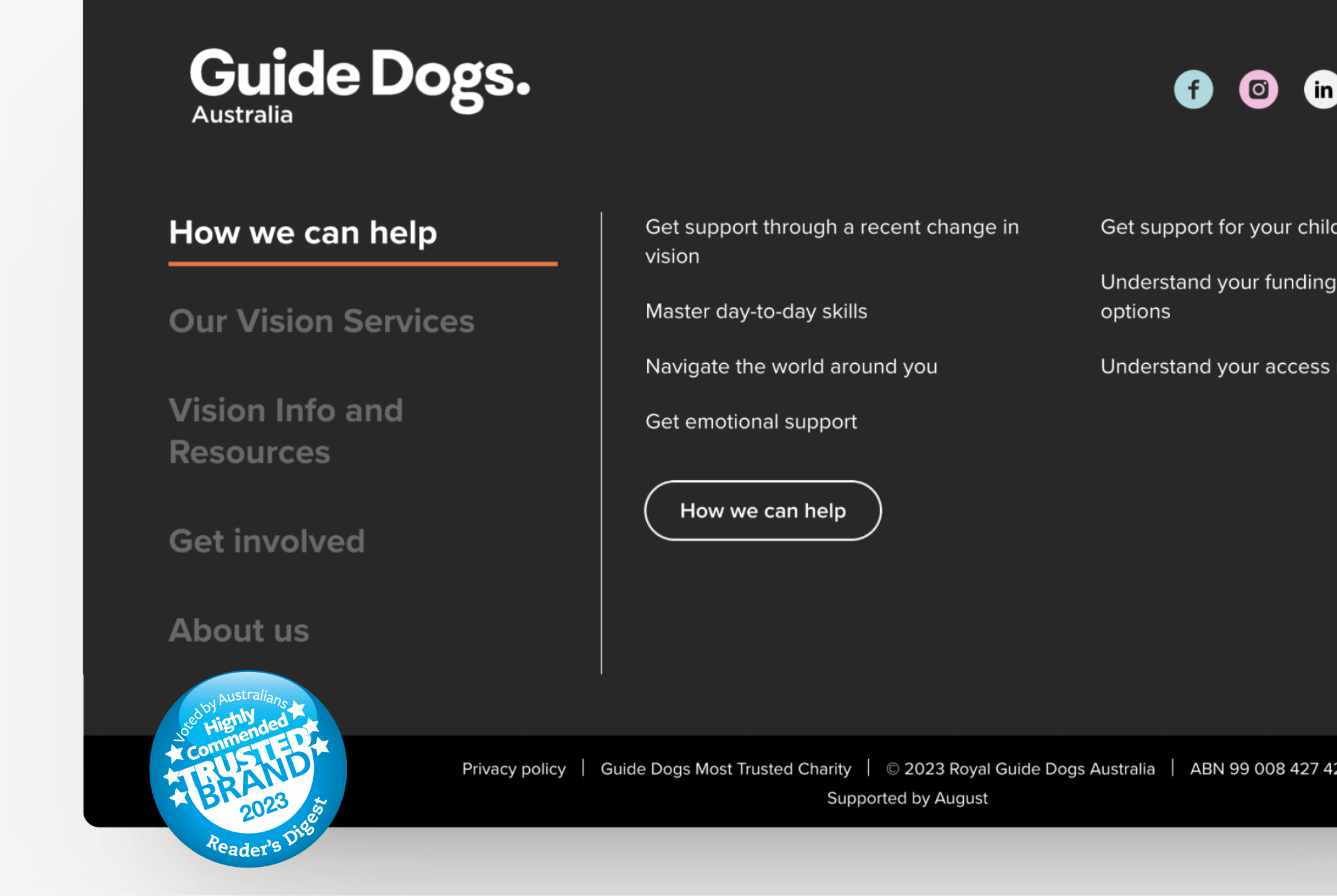
Guide Dogs uses its website’s global footer to help reiterate its status as a Highly Commended Trusted Brand.
By clicking the logo in the footer, you’re taken to an external page on the Trusted Brands website which describes Guide Dogs as being highly commended in the charity category.
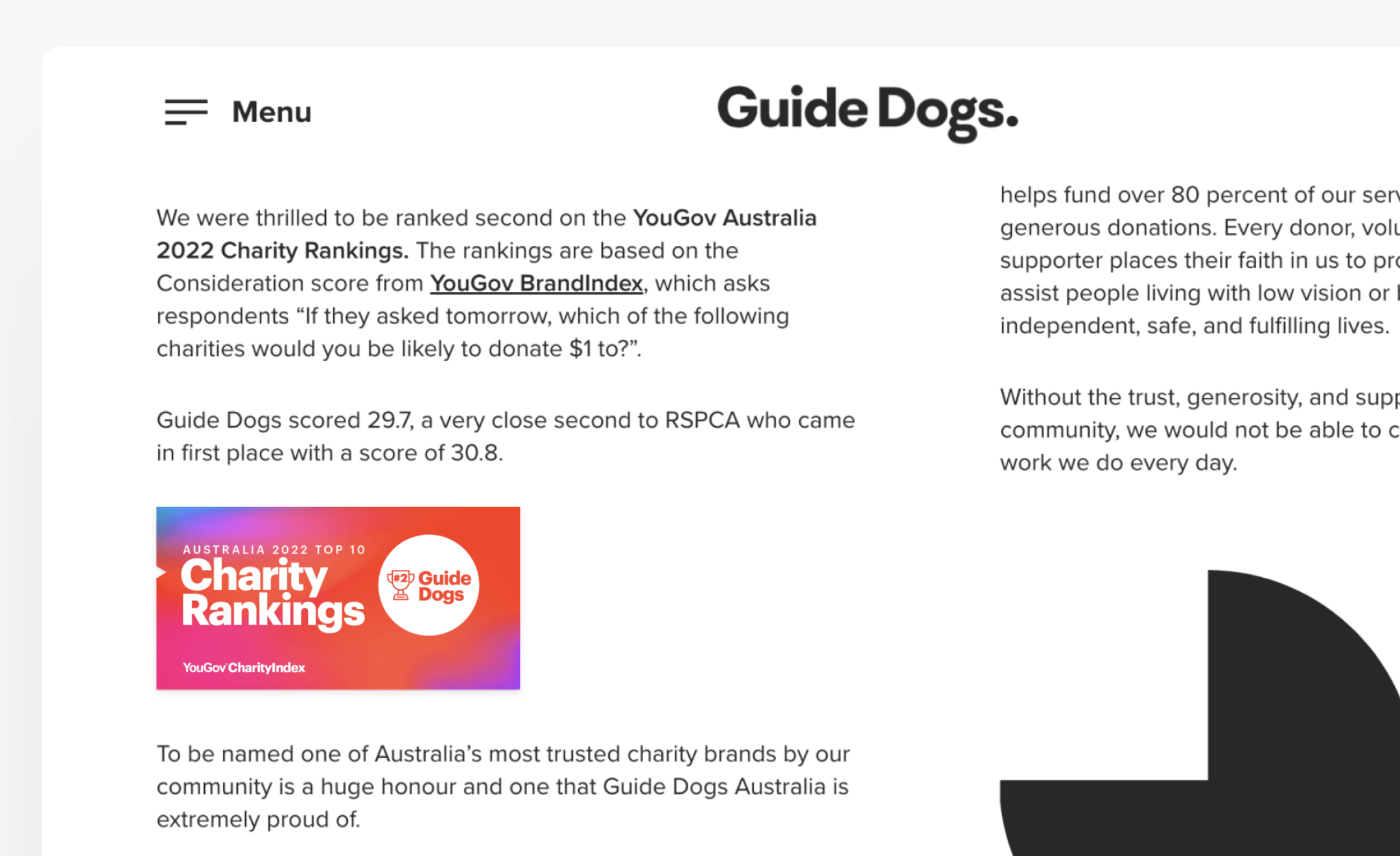
Elsewhere throughout the Guide Dogs sites, there’s additional information to highlight the fact the organisation placed second on the YouGov Australia 2022 Charity Rankings.
The footer also features links through to detailed content highlighting additional recognition from third-party organisations.
The Royal Society for the Prevention of Cruelty to Animals (RSPCA) takes a similar approach, highlighting its status as a registered charity and a licensed Mental Health First Aid Skilled Workplace.
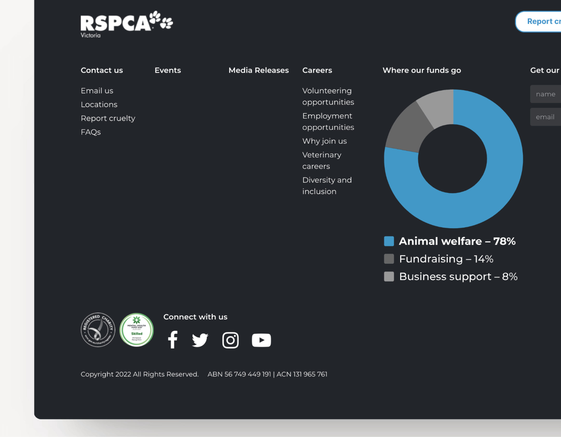
RSPCA’s website footer highlights its status as a registered charity, a Mental Health First Aid Skilled Workplace, and even offers transparent insights into how funding is used.
From a content perspective, highlighting media mentions from reputable third-party publications can have a similarly powerful endorsement effect. Animals Australia—Australia’s leading animal protection agency—regularly highlights when their campaigns and animal rights investigations are featured prominently in news and current affairs programs, like this example on the ABC 7.30 report from early 2023.
On the other hand, HESTA—an industry superfund with more than 1 million members—takes ‘endorsement from the community’ quite literally. It features prominent testimonials from members throughout its website. You can see examples on this page and this page.
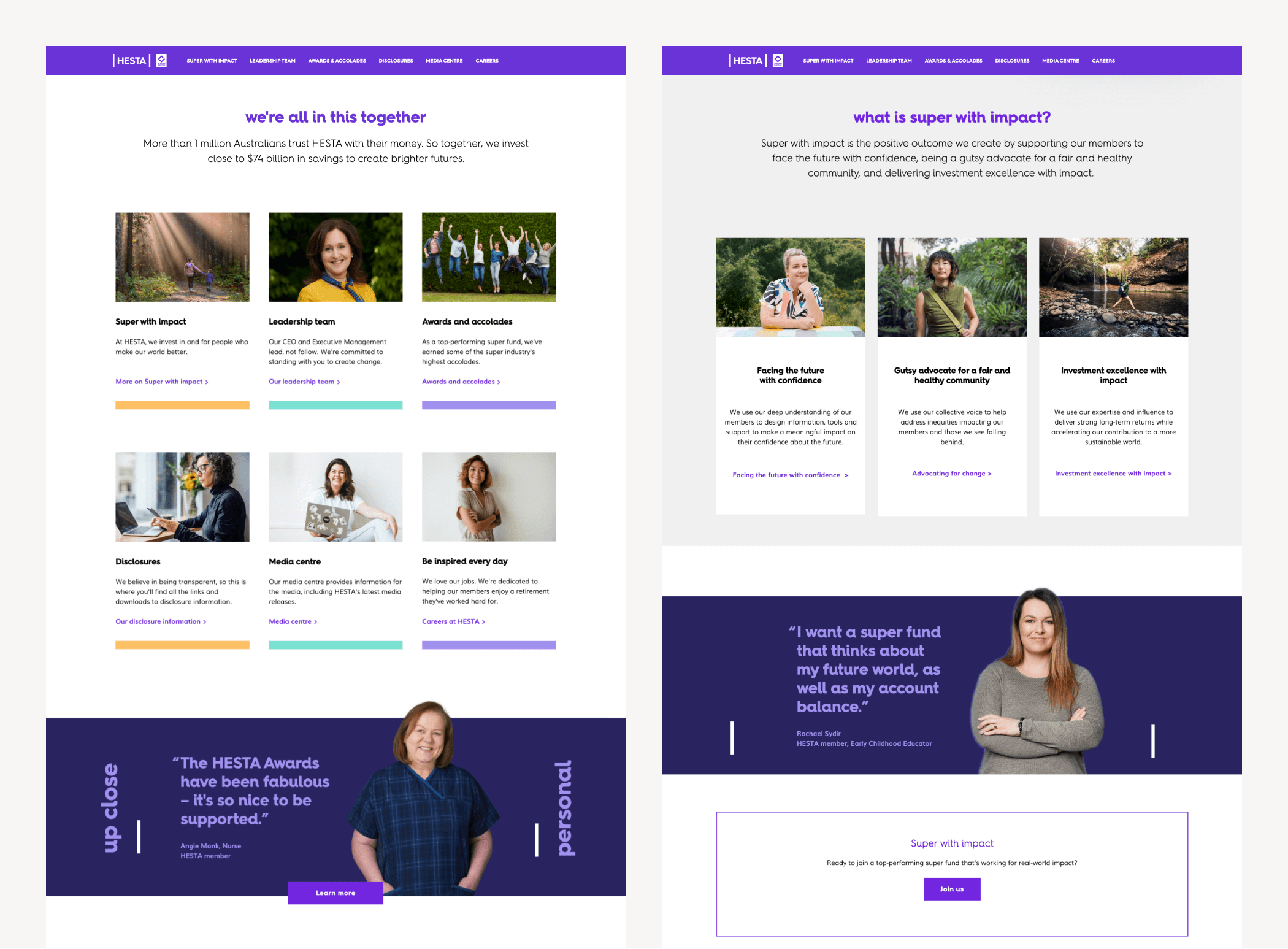
HESTA features members prominently throughout its website to highlight strong buy-in from existing supporters.
As another example of something comparatively small—but that conveys significant credibility—Guide Dogs uses visual cues to make it explicitly clear they offer secure payments to reassure prospective donors. This is achieved by a small visual icon that references compliance with the Payment Card Industry Data Security Standard, a global standard to reduce the risk of card data breach mandated by the leading Card Schemes.
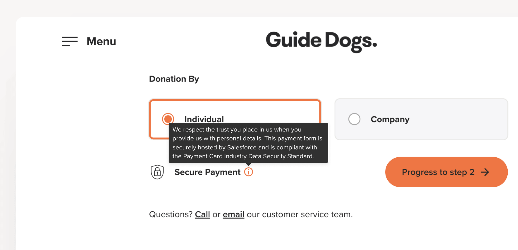
This small tooltip, built into the Guide Dogs donation form, provides reassurance for people before they commit to making a donation.
2. Invest time in crafting the ‘About us’ section of your site.
Some organisations see this type of content as an afterthought. This should change. People are increasingly values-based in the way they assess organisations and develop connections.
This global study of 8,000 consumers and 75 companies and brands reveals that:
‘Consumers are four to six times more likely to buy from, trust, champion, and defend companies with a strong purpose.’
Foresters Financial is a membership-based financial services organisation that conveys a sense of purpose in the way it articulates overarching investment strategy. There are clear links to a responsible investment policy, which outlines Foresters’ approach to aligning with ethical and ESG frameworks. The Foresters Financial website also includes important information pertaining to people, governance, and important disclosures. There are clear links to detailed whistleblower policies, responsible investment policies, annual reports, and more.
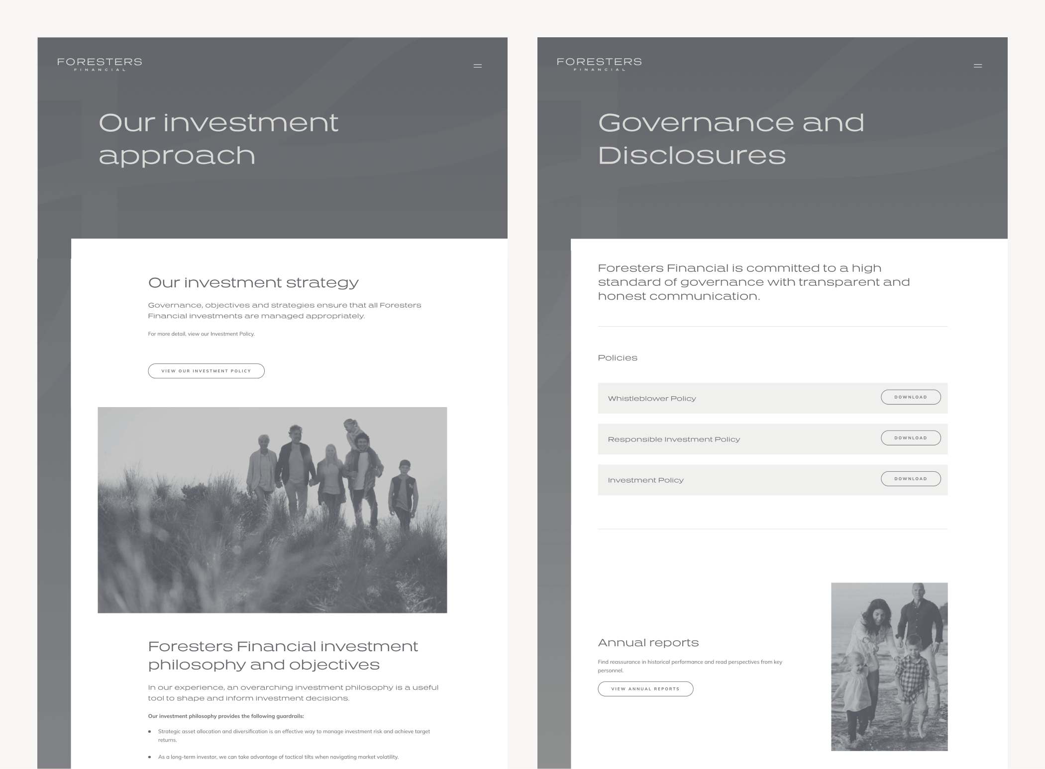
Foresters Financial offers transparent information about their approach to sustainable investment and organisational governance.
There are also detailed biographies for senior leadership team members. Transparency is proven to be key in building trust for many stakeholders: from members and donors to investors and corporate stakeholders, and from a company’s website to its boardroom.
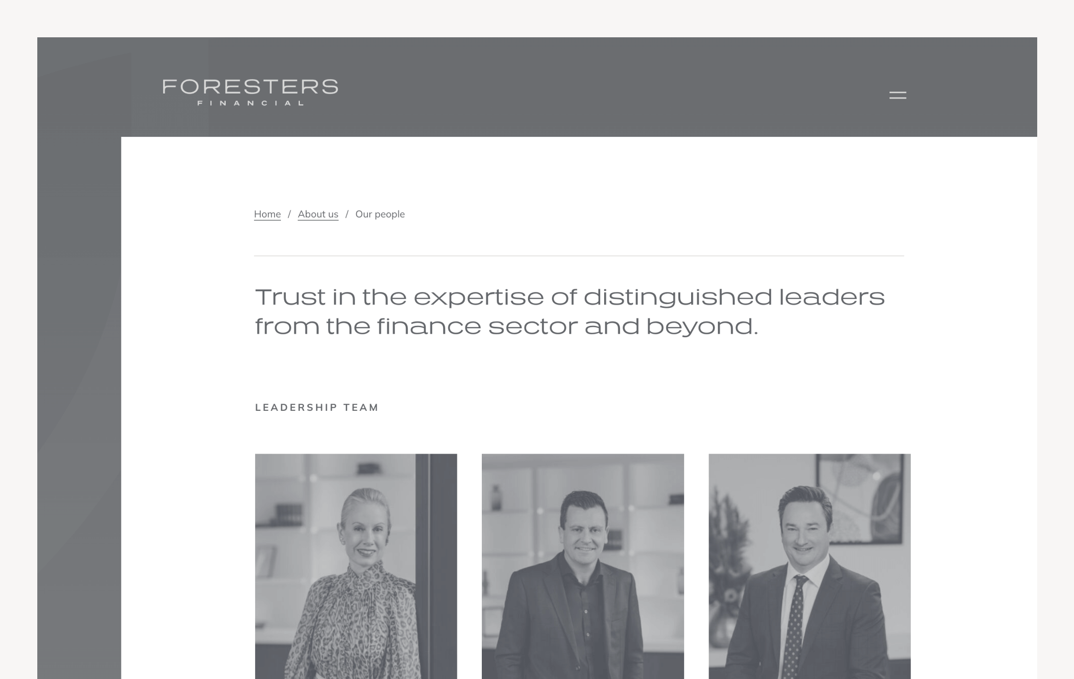
The Foresters Financial site also features detailed profiles and information about key personnel within the organisation: a technique proven to increase feelings of trust for various stakeholders.
HESTA provides another good example of using ‘About us’ content to transparently reiterate a purpose-led brand mission. The super fund’s site includes a page in its About Us section highlighting ‘how we use our collective voice to help address inequities impacting our members and those we see falling behind’. It then lists a series of policy submissions to various government departments on issues from homelessness and affordable housing to climate targets and strategies for gender equality.
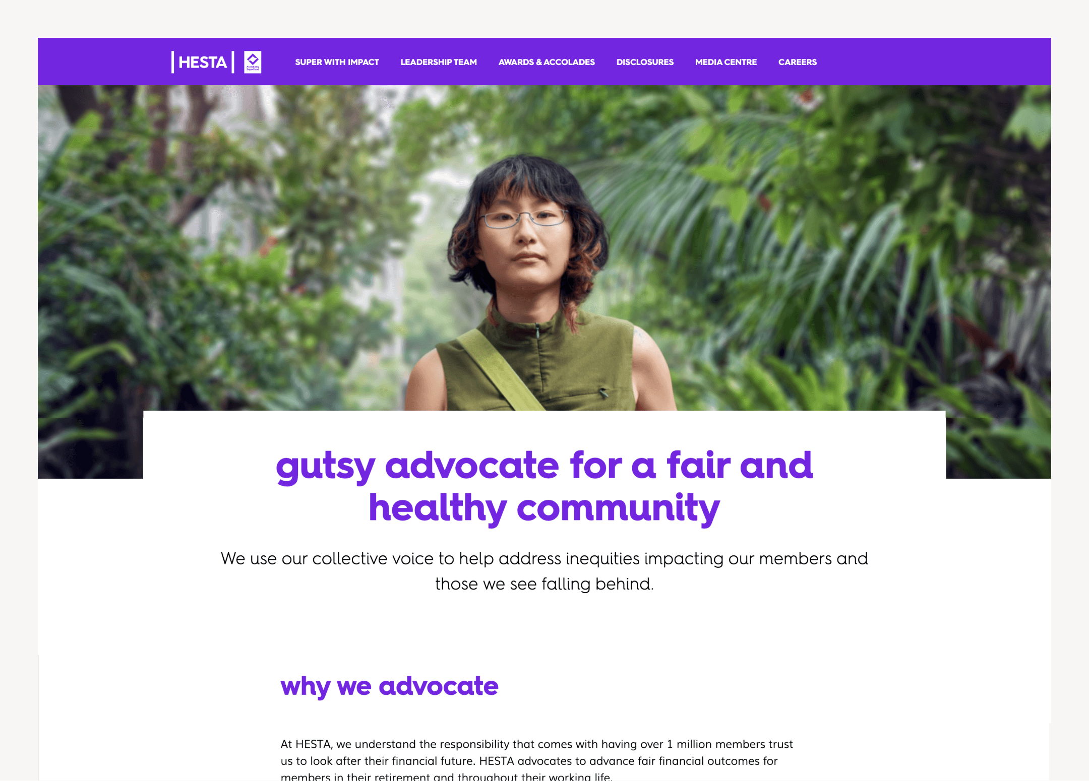
HESTA uses its ‘About Us’ content to reiterate the brand proposition of ‘super that makes our world a little better’; showing evidence that deliver on your brand proposition is an excellent way to build trust for prospective members.
3. Adopt and maintain ethical design principles.
To understand ethical design principles, it’s helpful to establish a contrast with the concept of unethical design, as seen in ‘dark UX’ patterns.
A dark UX pattern refers to a design practice in user experience that intentionally misleads or manipulates people to achieve a specific outcome. Usually, this outcome benefits the designer or the business at the expense of the user’s actual intended goal.
While they sometimes seem effective—and can provide short term gains—dark patterns are far more likely to erode trust, harm an organisation’s reputation long term, and create negative perceptions.
Examples of common dark UX patterns include:
- Misdirection: where visual signals or deceptive labels intentionally diver people’s attention away from their intended activity. An intrusive pop-up over editorial content is an example of misdirection.
- Forced continuity: making it difficult for people to leave a service by hiding the cancellation process, making it intentionally onerous, or difficult.
- ‘Roach motel’ design: intentionally creating a sense of entrapment by luring people into a process that is simple to begin but difficult to exit. Some companies purposefully design their ‘add to basket’ functionality so it’s confusing to remove items prior to check out.
- Privacy collection manipulation: intentionally obscuring data collection processes by making privacy settings complex and difficult to understand. You can read more about the value of human-centred privacy design here.
- Intentional reframing: manipulating an intended outcome by framing questions in a way that is difficult to navigate, or that initiates the inverse of what a person might logically expect. This often plays out in microcopy: ‘Yes, I don’t want to cancel my subscription’, is an example of microcopy that intentionally a function.
- Fraudulent ‘social proof’: creating fake indications that give the impression of importance or popularity, with statements like: ’15 people currently have this item in their cart, only 3 units left’.
In contrast, examples of ethical design practice include:
- Providing opt-in clarity: You can ensure people make consenting and conscious decisions about interacting with your organisation by ensuring all opt-ins are explicit, and not assumed or automated.
- Intuitive navigation: This involves creating goal-based experiences that clearly and logically guide people towards their objectives, rather than creating convoluted paths to confuse people.
- An accessible approach to privacy: Accessible privacy places peoples’ rights at the forefront, facilitating informed consent through information that is easy to understand, contextualised in the way that people would engage the policy, and written in human terms.
To build trust in your organisation, invest in robust and aesthetically pleasing visual design.
High quality design is scientifically proven to build greater levels of trust and credibility. This is crucial for the member-based organisations highlighted in this article, but equally important for all kinds of businesses and industry sectors: from not-for-profit organisations to social services and health and community care providers.
You don’t necessarily need to completely reinvent your whole brand or website to start building greater credibility with your supporters, clients or customers. As you’ll read in this piece, a systemised approach to the act of design itself can deliver serious value in a range of different ways.
If you’d like to understand how design can deliver serious, tangible benefits for your team or chat about any of the ideas or concepts mentioned in this article, drop us a line today.
More Articles
Up for some more?
Get your monthly fix of August happenings and our curated Super8 delivered straight to your inbox.
Thanks for signing up.
Stay tuned, the next one isn't far away.
Return to the blog.